Table of contents
Preamble
After a previous post to install Jupyter Lab and displaying charts suggested by Dominic Gilles it’s now time to move a bit further. Let’s be honest what I REALLY wanted to display is a Cloud Control performance like chart. Means an Active Sessions History visualization in python using one of the many available graphical libraries !
Of course any other performance charts are possible and if you have the query then display them in Jupyter Lab should be relatively straightforward…
I have initially decided to continue with Altair with the ultimate goal to do the same with leading Python graphical library called Matplotlib. At a point in time I expected to use Seaborn as an high level wrapper for Matplotlib but area charts have not been implemented at the time of writing this post (!).
Active Session History visualization with Altair
It all start with a Python query like:
%%SQL result1 << SELECT TRUNC(sample_time,'MI') AS sample_time, DECODE(NVL(wait_class,'ON CPU'),'ON CPU',DECODE(session_type,'BACKGROUND','BCPU','CPU'),wait_class) AS wait_class, COUNT(*)/60 AS nb FROM v$active_session_history WHERE sample_time>=TRUNC(sysdate-INTERVAL '1' HOUR,'MI') AND sample_time<TRUNC(SYSDATE,'MI') GROUP BY TRUNC(sample_time,'MI'), DECODE(NVL(wait_class,'ON CPU'),'ON CPU',DECODE(session_type,'BACKGROUND','BCPU','CPU'),wait_class) ORDER BY 1,2 |
But my first try gave below error:
result1_df = result1.DataFrame() alt.Chart(result1_df).mark_area().encode( x='sample_time:T', y='nb:Q', color='wait_class' ).properties(width=700,height=400) ValueError: Can't clean for JSON: Decimal('0.5833333333333333333333333333333333333333') |
I have been able to understand why using below commands. The nb column is seen as an object not a decimal:
>>> result1_df.info() <class 'pandas.core.frame.DataFrame'> RangeIndex: 444 entries, 0 to 443 Data columns (total 3 columns): sample_time 444 non-null datetime64[ns] wait_class 444 non-null object nb 444 non-null object dtypes: datetime64[ns](1), object(2) memory usage: 10.5+ KB >>> result1_df.dtypes sample_time datetime64[ns] wait_class object nb float64 dtype: object |
So I converted this column using:
result1_df[['nb']]=result1_df[['nb']].astype('float') |
I have set Cloud Control colors using:
colors = alt.Scale(domain=['Other','Cluster','Queueing','Network','Administrative','Configuration','Commit', 'Application','Concurrency','System I/O','User I/O','Scheduler','CPU Wait','BCPU','CPU'], range=['#FF69B4','#F5DEB3','#D2B48C','#BC8F8F','#708090','#800000','#FF7F50','#DC143C','#B22222', '#1E90FF','#0000FF','#90EE90','#9ACD32','#3CB371','#32CD32']) |
And set axis and series title using something like:
alt.Chart(result1_df).mark_area().encode( x=alt.X('sample_time:T', axis=alt.Axis(title='Time')), y=alt.Y('nb:Q', axis=alt.Axis(title='Average Active Sessions')), color=alt.Color('wait_class', legend=alt.Legend(title='Wait Class'), scale=colors) ).properties(width=700,height=400) |
Which gives:
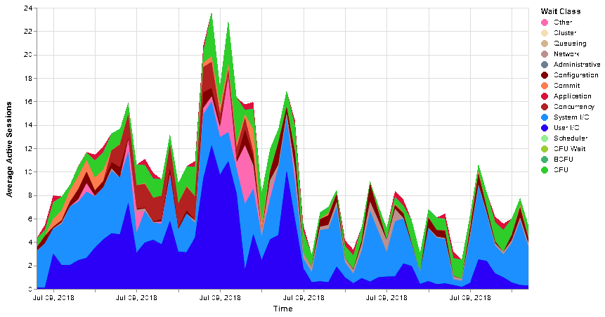
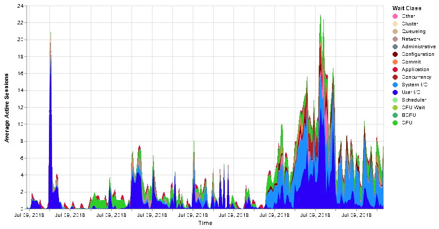
Or without time limitation (update the initial query to do so):
This is overall very easy to display interesting figures and I have to say that it is much much less work than doing it with Highchart and JavaScript.
You might have noticed that versus the Visualizing Active Session History (ASH) to produce Grid Control charts article I’m still lacking the CPU Wait figures. We have seen that query is something like (that I put in a different pandas dataframe):
%%sql result2 << SELECT TRUNC(begin_time,'MI') AS sample_time, 'CPU_ORA_CONSUMED' AS wait_class, value/100 AS nb FROM v$sysmetric_history WHERE group_id=2 AND metric_name='CPU Usage Per Sec' AND begin_time>=TRUNC(sysdate-interval '1' hour,'MI') AND begin_time<TRUNC(sysdate,'MI') ORDER BY 1,2 |
CPU Wait value is CPU plus background CPU subtracted by CPU used by Oracle, and only if value is positive… The idea is to create from scratch the result dataframe and add it to result1_df database we have seen above.
Creation can be done with:
result3_df=pd.DataFrame(pd.date_range(start=result1_df['sample_time'].min(), end=result1_df['sample_time'].max(), freq='T'), columns=['sample_time']) result3_df['wait_class']='CPU Wait' result3_df['nb']=float(0) |
Or:
result3_df=pd.DataFrame({'sample_time': pd.Series(pd.date_range(start=result1_df['sample_time'].min(), end=result1_df['sample_time'].max(), freq='T')), 'wait_class': 'CPU Wait', 'nb': float(0)}) |
Then the computation is done with below code. Of course you must handle the fact that sometime there is no value for CPU or BCPU:
for i in range(1,int(result3_df['sample_time'].count())+1): time=result3_df['sample_time'][i-1] #result=float((result1_df.query('wait_class == "CPU" and sample_time==@time').fillna(0))['nb']) cpu=0 bcpu=0 cpu_ora_consumed=0 #result1=result1_df.loc[(result1_df['wait_class']=='CPU') | (result1_df['wait_class']=='BCPU')]['nb'] result1=(result1_df.query('wait_class == "CPU" and sample_time==@time'))['nb'] result2=(result1_df.query('wait_class == "BCPU" and sample_time==@time'))['nb'] result3=(result2_df.query('wait_class == "CPU_ORA_CONSUMED" and sample_time==@time'))['nb'] if not(result1.empty): cpu=float(result1) if not(result2.empty): bcpu=float(result2) if not(result3.empty): cpu_ora_consumed=float(result3) cpu_wait=cpu+bcpu-cpu_ora_consumed #print('{:d} - {:f},{:f},{:f} - {:f}'.format(i,cpu,bcpu,cpu_ora_consumed,cpu_wait)) if cpu_wait<0: cpu_wait=0.0 #result3_df['nb'][i-1]=cpu_wait result3_df.loc[i:i,('nb')]=cpu_wait print('Done') |
For performance reason and to avoid a warning you cannot use what’s below to set the value:
result3_df['nb'][i-1]=cpu_wait |
Or you get:
/root/python37_venv/lib64/python3.7/site-packages/ipykernel_launcher.py:24: SettingWithCopyWarning: A value is trying to be set on a copy of a slice from a DataFrame See the caveats in the documentation: http://pandas.pydata.org/pandas-docs/stable/indexing.html#indexing-view-versus-copy |
Finally I have decided to concatenate result1_df dataframe to resul3_df dataframe and sort it on sample_time (if you do not sort it Altair might produce strange result):
result3_df=pd.concat([result1_df, result3_df]) result3_df=result3_df.sort_values(by='sample_time') |
To get final chart with CPU Wait figures. I have also added a tooltip to display wait class and value (but at the end I believe the feature is a bit buggy, sample_time is always set at same value in tooltip, or I don’t know how to use it):
colors = alt.Scale(domain=['Other','Cluster','Queueing','Network','Administrative','Configuration','Commit', 'Application','Concurrency','System I/O','User I/O','Scheduler','CPU Wait','BCPU','CPU'], range=['#FF69B4','#F5DEB3','#D2B48C','#BC8F8F','#708090','#800000','#FF7F50','#DC143C','#B22222', '#1E90FF','#0000FF','#90EE90','#9ACD32','#3CB371','#32CD32']) alt.Chart(result3_df).mark_area().encode( x=alt.X('sample_time:T', axis=alt.Axis(format='%d-%b-%Y %H:%M', title='Time')), y=alt.Y('nb:Q', axis=alt.Axis(title='Average Active Sessions')), color=alt.Color('wait_class', legend=alt.Legend(title='Wait Class'), scale=colors), tooltip=['wait_class',alt.Tooltip(field='sample_time',title='Time',type='temporal',format="%d-%b-%Y %H:%M"),alt.Tooltip('nb',format='.3')] ).properties(width=700,height=400) |

Are we done ? Almost… If you look closely to a Cloud Control Active Session History (ASH) chart you will see that the stack order of the wait class is not random nor ordered by wait class name. First come CPU, then Scheduler then User I/O and so on… So how to do that with Altair ? Well at the time of writing this blog post it is not possible. The feature request has been validated to be added and they alternatively propose a trick using calculate.
You can also use the order property of the stack chart but obviously it will order wait class by name (default behavior by the way). You can simply change the order with something like:
colors = alt.Scale(domain=['Other','Cluster','Queueing','Network','Administrative','Configuration','Commit', 'Application','Concurrency','System I/O','User I/O','Scheduler','CPU Wait','BCPU','CPU'], range=['#FF69B4','#F5DEB3','#D2B48C','#BC8F8F','#708090','#800000','#FF7F50','#DC143C','#B22222', '#1E90FF','#0000FF','#90EE90','#9ACD32','#3CB371','#32CD32']) alt.Chart(result3_df).mark_area().encode( x=alt.X('sample_time:T', axis=alt.Axis(format='%d-%b-%Y %H:%M', title='Time')), y=alt.Y('nb:Q', axis=alt.Axis(title='Average Active Sessions')), color=alt.Color('wait_class', legend=alt.Legend(title='Wait Class'), scale=colors), tooltip=['wait_class',alt.Tooltip(field='sample_time',title='Time',type='temporal',format="%d-%b-%Y %H:%M"),'nb'], order = {'field': 'wait_class', 'type': 'nominal', 'sort': 'descending'} ).properties(width=700,height=400) |
To really sort the wait class by the order you like till they allow it simply in the encode function, as suggested, you have to use the transform_calculate function and to be honest I have fight a lot with Vega expression to make it working:
from altair import datum, expr colors = alt.Scale(domain=['Other','Cluster','Queueing','Network','Administrative','Configuration','Commit', 'Application','Concurrency','System I/O','User I/O','Scheduler','CPU Wait','BCPU','CPU'], range=['#FF69B4','#F5DEB3','#D2B48C','#BC8F8F','#708090','#800000','#FF7F50','#DC143C','#B22222', '#1E90FF','#0000FF','#90EE90','#9ACD32','#3CB371','#32CD32']) #kwds={'calculate': 'indexof(colors.domain, datum.wait_class)', 'as': 'areaorder' } kwds={'calculate': "indexof(['Other','Cluster','Queueing','Network','Administrative','Configuration','Commit',\ 'Application','Concurrency','System I/O','User I/O','Scheduler','CPU Wait','BCPU','CPU'], datum.wait_class)", 'as': "areaorder" } alt.Chart(result3_df).mark_area().encode( x=alt.X('sample_time:T', axis=alt.Axis(format='%d-%b-%Y %H:%M', title='Time')), y=alt.Y('nb:Q', axis=alt.Axis(title='Average Active Sessions')), color=alt.Color('wait_class', legend=alt.Legend(title='Wait Class'), scale=colors), tooltip=['wait_class',alt.Tooltip(field='sample_time',title='Time',type='temporal',format="%d-%b-%Y %H:%M"),'nb'] #,order='siteOrder:Q' ,order = {'field': 'areaorder', 'type': 'ordinal', 'sort': 'descending'} ).properties(width=700,height=400).transform_calculate(**kwds) |

Here it is ! I have not been able to use the colors Altair scale variable in the computation (line in comment) so I have just copy/paste it…
Active Session History visualization with Matplotlib
Matplotlib claim to be the leading visualization library available in Python. With the well known drawback of being a bit complex to handle…
I will start from the result3_df we have just created above. Matplotlib is not exactly ingesting the same format as Altair and you are obliged like with Highchart to pivot your result. While I was asking me how to do I have touched the beauty of Pandas as it is already there with pivot function:
result3_df_pivot=result3_df.pivot(index='sample_time', columns='wait_class', values='nb').fillna(0) |
I also use fillna to fill non existing value (NaN) as you do not have session waiting for all wait class at a given time.
Then you need to finally import Matplotlib (if not yet installed do a pip install matplotlib) and you need to configure few things. The minimum required is figure size that you have to specify in inches. If like me you live in a metric world you would wonder how do I specify size in pixels, for example. I have found below trick:
>>> import pylab >>> pylab.gcf().get_dpi() 72.0 <Figure size 1008x504 with 0 Axes> |
Then you can divide size in pixels by 72 and use it in matplotlib.rc procedure:
import matplotlib # figure size in inches matplotlib.rc('figure', figsize = (1000/72, 500/72)) # Font size to 14 matplotlib.rc('font', size = 14) # Do not display top and right frame lines #matplotlib.rc('axes.spines', top = False, right = False) # Remove grid lines #matplotlib.rc('axes', grid = False) |
To get all possible parameters as well as their default values you can use:
>>> matplotlib.rc_params() RcParams({'_internal.classic_mode': False, 'agg.path.chunksize': 0, 'animation.avconv_args': [], 'animation.avconv_path': 'avconv', 'animation.bitrate': -1, 'animation.codec': 'h264', . . . |
You can also set a value using rcParams procedure and do not work with groups using rc procedure:
matplotlib.rcParams['figure.figsize']= [6.4, 4.8] |
As the most simple example you can use the Matplotlib wrapper of Pandas and do a simple:
result3_df_pivot.plot.area() |
Or if you want to save the figure in a file (on the machine where is running Jupyter Lab):
import matplotlib.pyplot as plt plt.figure() result3_df_pivot.plot.area() plt.savefig('/tmp/visualization.png') |
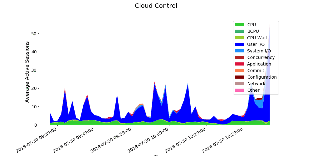
It gives the below not so bad result for lowest possible effort. Of course we have not chosen the colors and customize nothing but for a quick and dirty display it already gives a lot of information:

Of course we want more and for this we will have to enter in Matplotlib internals. The idea is to define a Pandas series with categories and related colors. Then build the data, colors and labels based of which wait class category we have. Finally a bit of cosmetic with axes label and chart label as well as label in top right corner:
from matplotlib.dates import DayLocator, HourLocator, DateFormatter, drange colors_ref = pd.Series({ 'Other': '#FF69B4', 'Cluster': '#F5DEB3', 'Queueing': '#D2B48C', 'Network': '#BC8F8F', 'Administrative': '#708090', 'Configuration': '#800000', 'Commit': '#FF7F50', 'Application': '#DC143C', 'Concurrency': '#B22222', 'System I/O': '#1E90FF', 'User I/O': '#0000FF', 'Scheduler': '#90EE90', 'CPU Wait': '#9ACD32', 'BCPU': '#3CB371', 'CPU': '#32CD32' }) data=[] labels=[] colors=[] for key in ('CPU','BCPU','CPU Wait','Scheduler','User I/O','System I/O','Concurrency','Application','Commit', 'Configuration','Administrative','Network','Queueing','Cluster','Other'): if key in result3_df_pivot.keys(): data.append(result3_df_pivot[key].values) labels.append(key) colors.append(colors_ref[key]) figure, ax = plt.subplots() plt.stackplot(result3_df_pivot.index.values, data, labels=labels, colors=colors) # format the ticks #ax.xaxis.set_major_locator(years) #ax.xaxis.set_major_formatter(yearsFmt) #ax.xaxis.set_minor_locator(months) #ax.autoscale_view() #ax.xaxis.set_major_locator(DayLocator()) #ax.xaxis.set_minor_locator(HourLocator(range(0, 25, 6))) #ax.fmt_xdata = DateFormatter('%Y-%m-%d %H:%M:%S') ax.xaxis.set_major_formatter(DateFormatter('%Y-%m-%d %H:%M:%S')) figure.autofmt_xdate() plt.legend(loc='upper right') figure.suptitle('Cloud Control', fontsize=20) plt.xlabel('Time', fontsize=16) plt.ylabel('Average Active Sessions', fontsize=16) plt.show() figure.savefig('/tmp/visualization.png') |
Looks really close to a default Cloud Control performance active session history (ASH) chart:


 to produce Grid Control charts")
Chakravarthi says:
Hello
I am trying to reproduce the same in my laptop but its failing. Could you please give me these steps in a file, so that I can understand and try executing it.
1) How the Python connects the Database?
2) Where the rows and columns are saved?
3) How these vendor tools reads and provides charts for us.
basically, I am looking for a complete Python script in a single file.
Yannick Jaquier says:
Hello,
I think that you have all what’s required with this post and the previous one:
Jupyter Lab installation on Fedora to access an Oracle database